
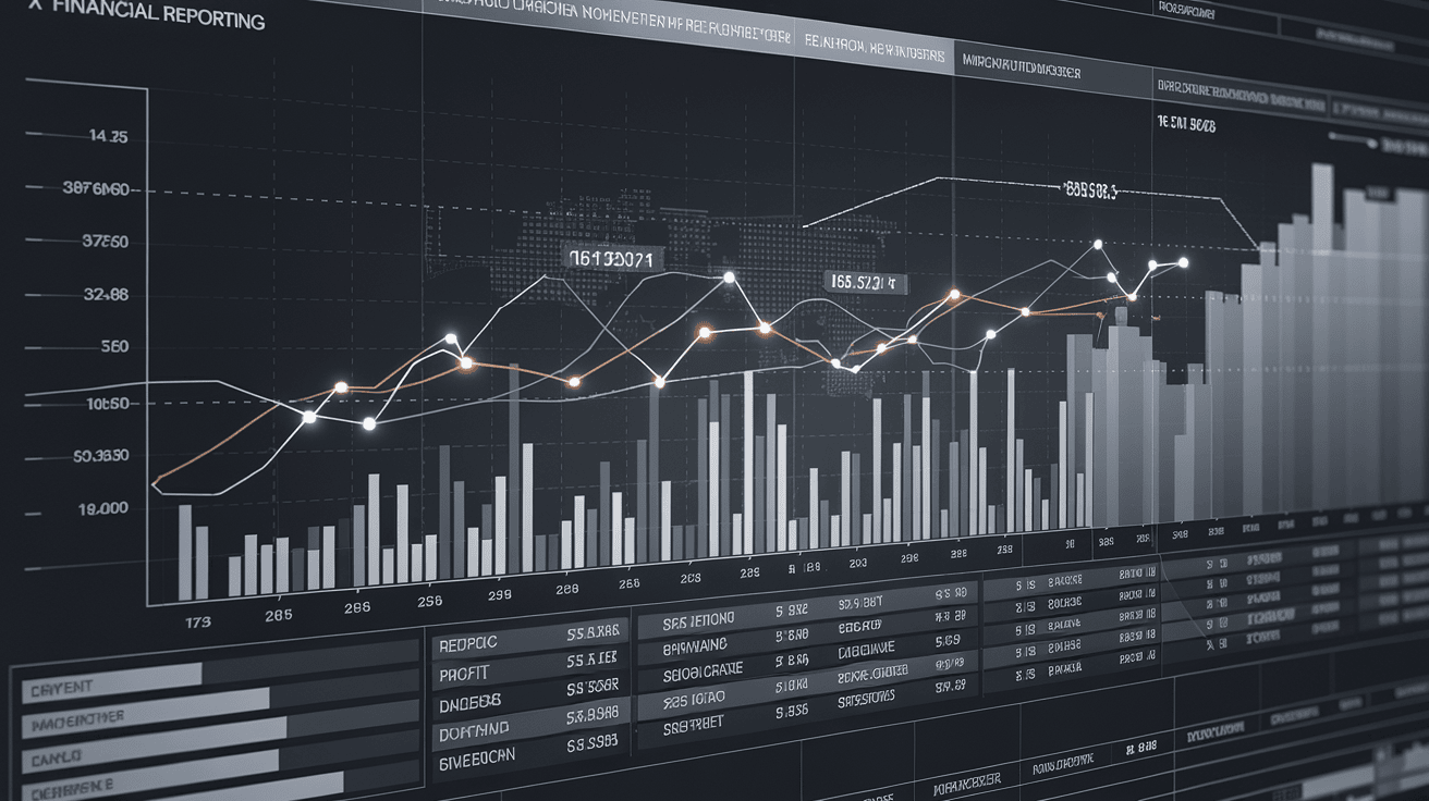
Data Visualization Techniques for Financial Reporting
Introduction
In the era of big data and financial technology (FinTech), financial institutions generate vast amounts of complex data daily. Banks, investment firms, and financial service providers must interpret, analyze, and present this data efficiently to drive informed decisions. However, financial data is often intricate, making it challenging to communicate effectively to stakeholders, investors, and regulatory bodies.
This is where data visualization plays a crucial role. By transforming raw financial data into clear, intuitive, and visually appealing formats, businesses can improve decision-making, detect anomalies, and comply with financial regulations.
This article explores the most effective data visualization techniques for financial reporting, real-world case studies, and emerging trends shaping the banking industry.
Why Data Visualization Matters in Financial Reporting
Financial reports serve as the backbone of decision-making in banking and financial services. They help in:
- Identifying Trends – Spotting revenue growth, expense patterns, and risk factors.
- Enhancing Transparency – Making financial data more accessible to stakeholders.
- Regulatory Compliance – Meeting reporting standards set by authorities such as Basel III, IFRS, and GAAP.
- Risk Management – Visualizing credit risks, fraud detection, and loan defaults.
Incorporating advanced visualization techniques in financial reporting improves accuracy, clarity, and efficiency, allowing banking institutions to respond proactively to market fluctuations.
Best Data Visualization Techniques for Financial Reporting
1. Bar Charts and Column Charts – For Comparative Analysis
Use Case: Comparing financial performance over time.
Example: A year-over-year revenue growth bar chart helps banks assess profitability and track key financial metrics such as net income, operating expenses, and ROE (Return on Equity).
💡 Best Practices:
✔ Use color coding for clarity.
✔ Apply percentage change indicators for quick insights.
✔ Keep labels short and meaningful.
2. Line Charts – For Tracking Trends Over Time
Use Case: Analyzing stock market fluctuations, interest rates, and loan performance.
Example: JPMorgan Chase uses line charts to track its quarterly loan origination trends, providing insights into credit growth and consumer demand.
💡 Best Practices:
✔ Use multiple lines to compare different financial metrics.
✔ Add trend lines to show upward/downward movements.
✔ Implement tooltips for interactive data exploration.
3. Pie Charts and Donut Charts – For Proportional Analysis
Use Case: Visualizing expense breakdowns, asset allocation, and investment diversification.
Example: Citibank uses pie charts in its investment portfolio dashboards to showcase asset distribution across stocks, bonds, and alternative investments.
💡 Best Practices:
✔ Avoid using too many categories (limit to 5-7).
✔ Use percentages instead of raw numbers for better comparison.
✔ Implement hover effects for interactive details.
4. Heat Maps – For Identifying Patterns and Anomalies
Use Case: Fraud detection, risk assessment, and branch performance monitoring.
Example: HSBC utilizes heat maps to visualize customer spending habits, identifying unusual spikes that could indicate fraudulent transactions.
💡 Best Practices:
✔ Use a gradient color scheme for clarity.
✔ Ensure data normalization for accuracy.
✔ Apply interactive filters for in-depth analysis.
5. Sankey Diagrams – For Tracking Financial Flows
Use Case: Tracing cash flows, fund movements, and expense distributions.
Example: Goldman Sachs integrates Sankey diagrams in its financial reports to illustrate capital inflows and outflows across investment portfolios.
💡 Best Practices:
✔ Use contrasting colors for different cash flow categories.
✔ Label key financial sources and destinations clearly.
✔ Keep paths simple and readable.
6. Waterfall Charts – For Understanding Financial Breakdown
Use Case: Explaining profit and loss (P&L) statements, revenue drivers, and cost components.
Example: Morgan Stanley leverages waterfall charts to break down revenue contributions from different business segments.
💡 Best Practices:
✔ Clearly mark starting and ending points.
✔ Highlight positive and negative impacts with different colors.
✔ Ensure logical sequencing of financial elements.
7. Dashboard Visualizations – For Real-Time Financial Monitoring
Use Case: Real-time tracking of KPIs, risk exposure, and portfolio performance.
Example: Barclays Bank utilizes interactive dashboards to monitor credit risk exposure, enabling risk managers to take preventive actions.
💡 Best Practices:
✔ Combine multiple charts for a comprehensive overview.
✔ Ensure mobile-friendly design for accessibility.
✔ Implement real-time data updates for accuracy.
Case Studies: How Leading Banks Use Data Visualization
Case Study 1: JPMorgan Chase – Enhancing Loan Risk Assessment
🔹 Challenge: JPMorgan needed a solution to visualize loan default risks across different customer segments.
🔹 Solution: They implemented interactive dashboards with heat maps and bar charts to monitor risk exposure dynamically.
🔹 Outcome: The new system reduced loan defaults by 15% by enabling proactive decision-making.
Case Study 2: Citibank – Improving Investment Insights
🔹 Challenge: Citibank wanted to simplify investment portfolio insights for wealth management clients.
🔹 Solution: They introduced pie charts, waterfall charts, and Sankey diagrams in their portfolio reports.
🔹 Outcome: Customer engagement increased by 30%, leading to better-informed investment decisions.
Key Trends and Future of Data Visualization in Banking
📌 AI-Powered Data Visualization – AI tools like Tableau and Power BI enable automated financial insights.
📌 Interactive & Real-Time Dashboards – Live data feeds improve decision-making speed.
📌 Blockchain & Data Transparency – Enhances auditability and fraud detection.
📌 Augmented Analytics – Uses machine learning to identify financial trends.
📌 3D & Immersive Visualization – Provides advanced risk simulations.
Conclusion: The Future of Financial Data Visualization
Financial institutions and FinTech companies must leverage advanced data visualization techniques to stay competitive. As the industry embraces real-time analytics, AI-driven insights, and interactive dashboards, financial reporting will become more efficient, transparent, and data-driven.
To succeed, banks should:
✅ Invest in modern data visualization tools.
✅ Train employees in data literacy and analytics.
✅ Ensure compliance with financial regulations and data security protocols.
With the right visualization strategies, banks and financial institutions can turn raw data into actionable insights, empowering them to navigate market complexities with confidence.
#DataVisualization #FinancialReporting #FinTech #BankingAnalytics #BigData #DataScience #RiskManagement #FinanceTech #AIinBanking #BusinessIntelligence #Tableau #PowerBI #BankingTrends #InvestmentInsights #WealthManagement #FinancialAnalysis #DataDriven #FinanceData #MachineLearning #DataGovernance

Introduction The rapid growth of digital banking, financial technology (FinTech), and data-driven decision-making has created a pressing need for scalable…

Introduction In the fast-evolving landscape of financial technology (FinTech), regulatory compliance is a cornerstone for maintaining stability, trust, and legal…